

It’s never been more important for education systems to demonstrate impact from their professional learning programs. The policy shift from test-based outcomes to more flexible, comprehensive success standards has brought new possibilities — and challenges — to every level of operations, and that includes professional learning.
Join KickUp as we examine six of the most common roadblocks to thriving data cultures. With practical tips, guiding questions, and real-life examples of districts excelling through data, you can push your professional learning program to new levels of effectiveness.
A good foundation is critical to your professional learning plan’s success — but all the value alignment, calendar coordination and guiding philosophy in the world won’t guarantee a good outcome. Without clear intention for what the final product will actually do, the people it’s serving won’t be able to make sense of the “why do we have this?,” let alone the “how do we use this?”
Today: simplifying data presentations for accessibility, understanding and buy-in.
TACKLING COMMON DATA ISSUES | PROBLEM 5
As we’ve said before, educators are people — people with some of the toughest jobs around. They don’t have a lot of time to review non-essential data. Think carefully about what they actually need to know before creating your report.
What are you trying to accomplish by sharing this data? Will it have a real, tangible impact on the principals’ learning plan, or are you simply showing off the program’s end-of-year accomplishments?
When you’re already familiar with the data, you can jump right in and start drawing conclusions — but someone who’s new to it needs some help to get their bearings. This kind of thinking requires applying a disciplined approach to structure reports in a way that’s intelligible to someone without your background knowledge.
Evidence-based management (EBM) theory is a cross-industry body of work on incorporating complex information into operational logistics. While much of its thinking is concerned specifically with business practice, EBM offers some excellent perspectives with regard to education administration as well.
The core model of EBM is a Venn diagram that incorporates four core factors — external evidence, practitioner experience, local context, and stakeholder preferences — equally into the decision-making process:
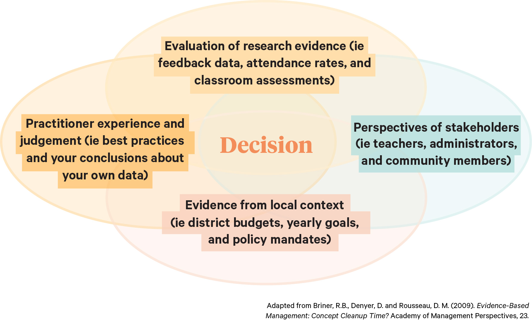
As a data practitioner, much of your thinking is likely focused around the top and left circles. But bringing educators and other district stakeholders fully into the conversation means recognizing that the bottom and right circles are just as critical – and making sure the team knows about that commitment.
Think of your data set as a boulder, and the insights as the minerals buried inside. You’re not going to get the results you’re looking for with one swing of the pickaxe. Instead, concentrate on tapping out large “chunks” and then breaking those down by focus area.
Bear in mind that a data point doesn’t need to be headline-worthy on its own to deliver value. A small shift — a 2% approval bump here, a two-person attendance dip there — can still present compelling possibilities when taken in the aggregate.
People are visual thinkers, and the wealth of tools out there means it’s never been easier to translate rows of numbers into exciting and colorful visualizations. But all too often, reports become cluttered with charts and graphs until the synthesis, trends, and points they’re meant to highlight become lost in the noise.
You can achieve elegant, well-balanced data visualizations by remembering three fundamental principles: restrain, reduce, and emphasize. Restrain the overall number of visualizations and reduce their complexity as much as possible to emphasize your point.
Best yet, interactive visualizations that allow users to flexibly move between groupings open the possibility for deeper trend analysis — and give users the opportunity to engage with and internalize the data on their own terms.
Data is like a fractal: the closer you look at it, the more it can reveal.
Let’s take the combined classroom walkthrough scores from one school over the course of one year. As an average, this figure won’t tell you a lot. But digging a little deeper, you can ask:
On the same note, don’t be afraid to contrast (not compare) two unrelated but striking statistics. “Correlation does not equal causation” is a common saying in the data world for a reason. Two changes occurring at the same time doesn’t mean that one has been caused by the other — but putting them side-by-side can yield unexpected insights.
For example, let’s say this is the first year you’ve evaluated a new ELA training program. “72% of high school teachers say the new ELA training is meeting their needs” doesn’t give the listener much to work with without last year’s context. Is 72% a “good” number or a bad one? But “72% of high school teachers say the training meets their needs. That’s a better approval rate than teachers gave the school lunch!” provides indirect context that helps solidify the team’s understanding.
As team leader, you’re in charge of producing, analyzing, and delivering the final data set. But carefully delegating parts of the process can have unexpected benefits. Sharing responsibility for data collection gives your teacher-leaders and school-level administrators practice in the ins and outs of working directly with data — and makes sure they feel comfortable with and in control over the numbers when it’s time to break things down.
Finding meaning in professional learning data shouldn’t require a degree in statistics. Most often, analyzing data requires only basic math (and good organizing). That’s a philosophy KickUp partner Francis Howell School District (FHSD)—a Missouri school district home to more than 17,000 students—applies in their data collection plan.
FHSD launched a personalized learning strategy in the 2018-19 school year, with the eventual goal of enrolling each of their 1,200 teachers in one of 40+ individualized content strands. To avoid diving in without a plan, they began with a needs assessment that gauged teacher preference, best practice, historical performance and district goals.
After collecting data on teacher needs and progress, FHSD created facilitator reports that filtered down to strand-specific objectives and participants. This grounded the display of data in its core uses: planning, course correction, and follow-up. By applying a disciplined view to their data focus, FHSD empowered facilitators to make immediate improvements and ground decision-making in their specific audience.
Schedule a demo with one of our friendly team members.

.png)